


FontFX
RISCWorld
FontFX Special Effects
Shadow and Border Effects
An attractive special effect can be a shadow of your string behind the characters themselves. This effect is activated by clicking on one of the 'Shadow' icons with SELECT .
A 'wall' shadow can be imagined by shining a light at your characters from immediately in front of them, creating a shadow on a wall behind.
A 'floor' shadow is created by shining a light from above, creating a shadow on the floor behind. The 'floor' shadow is most effective on a string which has not been rotated, sloped or leant.
A '3D' shadow is created by having a smaller version of the string in the background, which is joined to the full-size string in the foreground. The shadow colour can be selected much as outline and fill colours are, except that if no shadow option is selected, the shadow colour will be shown greyed out, and you will not be able to change this: as soon as you select one of the shadow options, the shadow colour will be restored to the correct colour, and you will then be able to change it. If you subsequently switch off the shadow option, the shadow colour will automatically revert to being greyed out. In a 3D shadow, the shadow colour is the colour of the rear of the 3D effect, with the intermediate parts blending from there to the fill colour of the foreground.
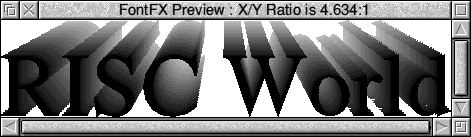
One particularly nice effect is to have no outline colour, fill colour white and a wall shadow: try it and see! You can also set the direction in which you want your shadow to fall, and the distance (wall/3D) or length (floor) of the shadow. You can alter the direction by typing in a number, by clicking on the up and down arrows or by clicking on the compass. To alter the distance/length, drag the slider left or right.
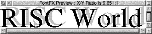
The Border effect adds an outline to all the characters in your string. If no outline colour is selected, this border will be the same colour as the fill colour of the characters, with a gap between the border and the character. The colour of this gap can be determined by the user, but if you choose the same gap colour as fill colour, an alternative gap colour will be used. This is shown in a triangular flash across the icon which shows the normal gap colour. If you select an outline colour, the border will have this colour. Note that you cannot select the border effect at the same time as the stencil effect. The outline width setting will affect the thickness of the border and the gap.
Stencil Effect
This creates a solid area with the characters of your string 'cut out' in the middle.
The colour of the solid area (the 'frame' ) is the 'fill' colour you have selected in the control window (which means that you cannot select the rainbow option at the same time as the stencil option). Should you select an outline colour, this will appear around the characters but not around the frame.
If you import a drawing like this into !Draw and place it on top of another object, you will find that the other object shows through the characters of your string: in other words, the characters are transparent. This would allow you to create some interesting effects - for example, if you create your drawing with a white fill colour, and place the created drawing on top of a repetitive pattern, you will create pattern-filled characters on an apparently white background.

Alternatively, you might use a desktop publishing package to type inside the created characters. The size of the frame can be altered by clicking on the menu button next to the current size icon, or by clicking the mouse MENU button over the size icon, and selecting an alternative size from the menu that appears.
Ripple and Jiggle
Normally, all the characters in your drawing will be sitting on an invisible baseline which is straight. The ripple and jiggle effects alter the baseline, making it ripple (i.e. a regular deviation from character to character like a wave) or jiggle (an irregular deviation, chosen at random for each character). Either of these effects can be chosen by clicking on the appropriate icon with SELECT . To deselect one of these effects, either select the other, or click with ADJUST . Note that the column and circle options described below cannot be selected at the same time as ripple or jiggle, but stencil, rotate, slope, lean and arc can be.
Column
The column option sets your string in a vertical column, each character placed beneath the previous one. You cannot select column at the same time as ripple, jiggle, circle, rotate, slope, lean or arc. Beware of bizarre effects if you select a floor shadow with a column - not recommended! You should also remember that 'columns' look best with 'capital' letters - no pun intended!
Circle
This effect makes the characters of your string follow the circumference of an imaginary and invisible circle. There are three versions of the circle effect: a clockwise circle, an anti-clockwise circle, and a bi-directional circle, where the string will be split into two parts at the nearest word break to the middle, with the first half laid out clockwise and the remainder anti-clockwise. In each case, the point around the circle that the text starts from can be set using the angle compass. The default direction is clockwise, and this is the option that will be set when you first select 'Circle'.
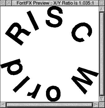
You can also select an optional shape which will be drawn inside the text circle: this can be either a circle, a square, a diamond or a five-pointed star. Finally, you can choose to have the spaces between words replaced by a dot. Note that neither stencil, ripple, jiggle, column, rotate, slope, lean nor arc can be selected at the same time as circle.
Warning: not all fonts are suitable for use in a circle, particularly when you are mixing upper and lower case characters in your string, so be prepared to have to select an alternative font if the drawing you create does not look right.
Arc
Arc is similar to a circle effect, except that the text only follows a part of a circle and not a whole circle. The number of degrees of this arc is given in the angle box. Obviously, you cannot have an arc of 0°, so if the angle is set to 0 when you select 'arc', it will be automatically changed to 45°. Whilst 'arc' is selected, you will not be able to set the angle to 0°. You can alter the angle by typing in a number, by clicking on the up and down arrows or by clicking on the compass. Remember that in order to fit all the characters in neatly, the smaller the angle of arc, the larger the radius of the imaginary circle: this means that the smaller angle, the flatter the arc will be. You can have either a clockwise or an anticlockwise arc, but not a bi-directional one! You can also change the spaces between words to dots, as with a circle.
Rotate, Slope and Lean
Rotate rotates the baseline of your string by the angle shown in the box, but the characters of the string remain normal. An angle of 0° is a normal baseline, 45° goes from bottom left to top right, 90° from bottom to top and so on - that is, the baseline rotates anti-clockwise as the angle increases. The angle is altered as described above under the Arc option.
Slope also uses the angle setting, but this time, whilst the baseline and horizontal element of the characters are rotated, the vertical element of the characters is not. For example, a slope of 45° would mean that the horizontal bar of a capital T would be at 45° (instead of the normal 0°), but the vertical bar would remain at 90° as normal. Using slope can give some strange effects: a slope of 90° or 270° makes the string disappear altogether, so FontFX won't let you do it! Any slope between 95° and 265° gives a mirror image of the string in the Y-axis.
Lean is similar to slope, except it is the vertical, or Y-axis, that is rotated, and not the baseline or the horizontal. For example, a lean of 45° would make the vertical bar of a capital T lean 45° to the left, but the horizontal bar would remain parallel to the baseline at 0°. Again, some strange effects can be given by lean: a lean of 90° or 270° makes the string disappear and so is not allowed, and between those values, the string is reflected about its X-axis. Lean angles from 275° to 355° are similar to italicization.
Because it is sometimes difficult to visualise the effect of rotate, slope and lean, a small 'example' window opens showing how the word 'FontFX' would look based on your current setting. This remains open whilst you alter the angle, and closes a few seconds later. If you want to re-open it to check the setting, just click on rotate, slope or lean again.
Grow and Shrink
These simple effects make each character in the string a different size. When 'Grow ' is selected, the character at the beginning of the string will be smaller than your chosen fontsize, with the character at the end full size.
With 'Shrink', the sizes are reversed. If you have the 'Then...' option selected along with 'Grow', the middle character(s) will be 100% and the start and end characters will be smaller.
Similarly, 'Shrink then grow' starts at 100%, the middle is smaller and then the end will be 100% again. The actual size of the smallest character in the string is defined by a percentage reduction setting: i.e., if this setting is 75% reduction, the smallest character will be 25% of the normal fontsize. This effect is very effective when used in conjunction with circle and arc, or with slope to create perspective.
RISCWorld